Data Visualization Builder
Reimagining the entire data visualization creation experience gives users clear steps and predictable results
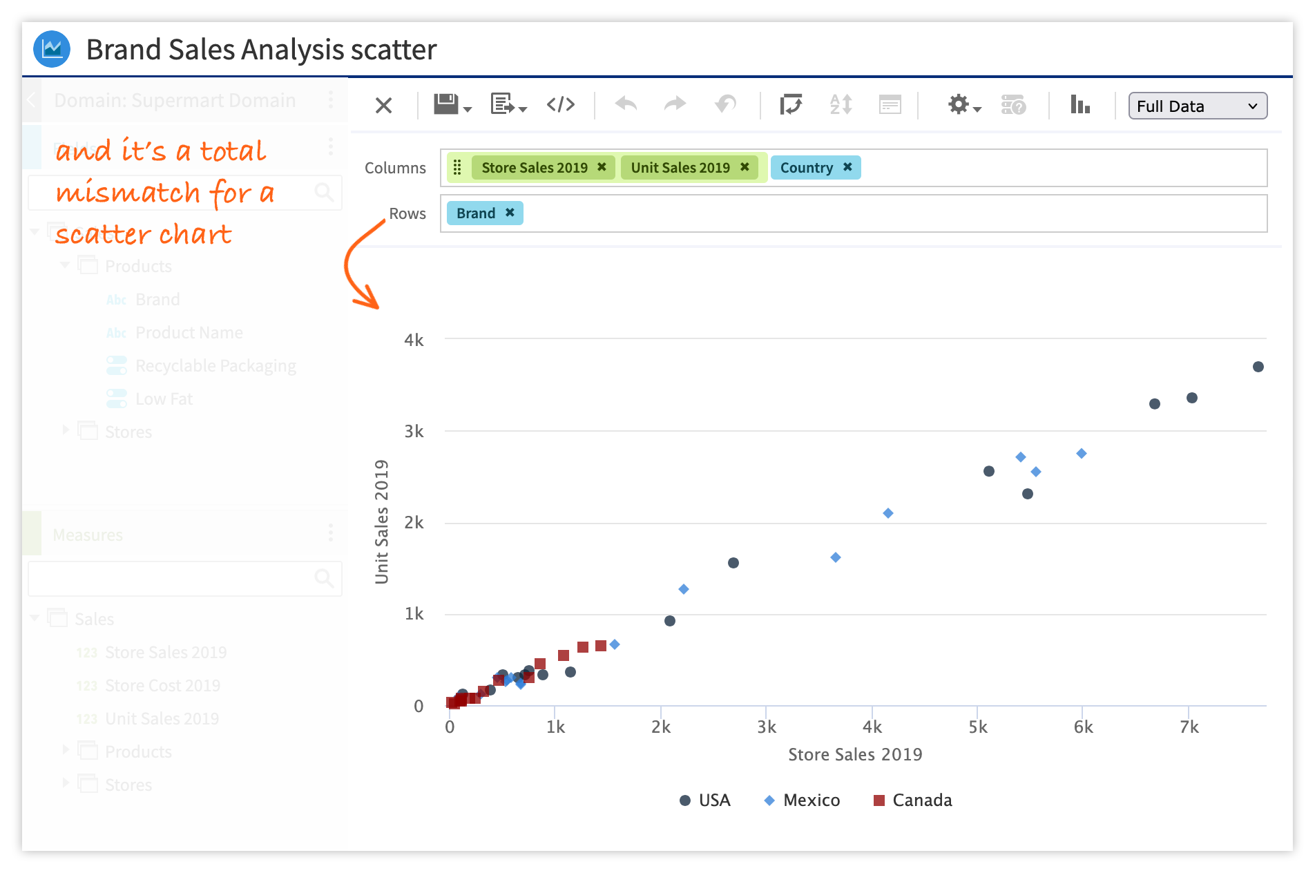
An unclear UI for building data visualizations led to guesswork for users
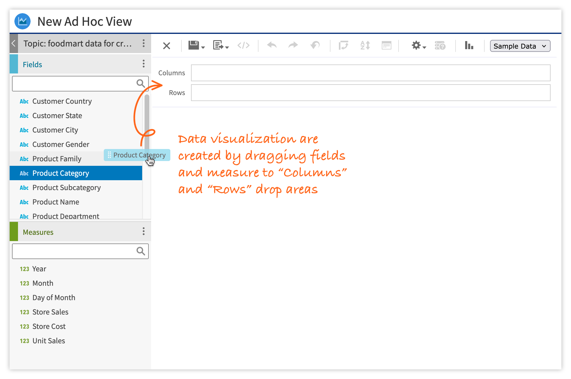
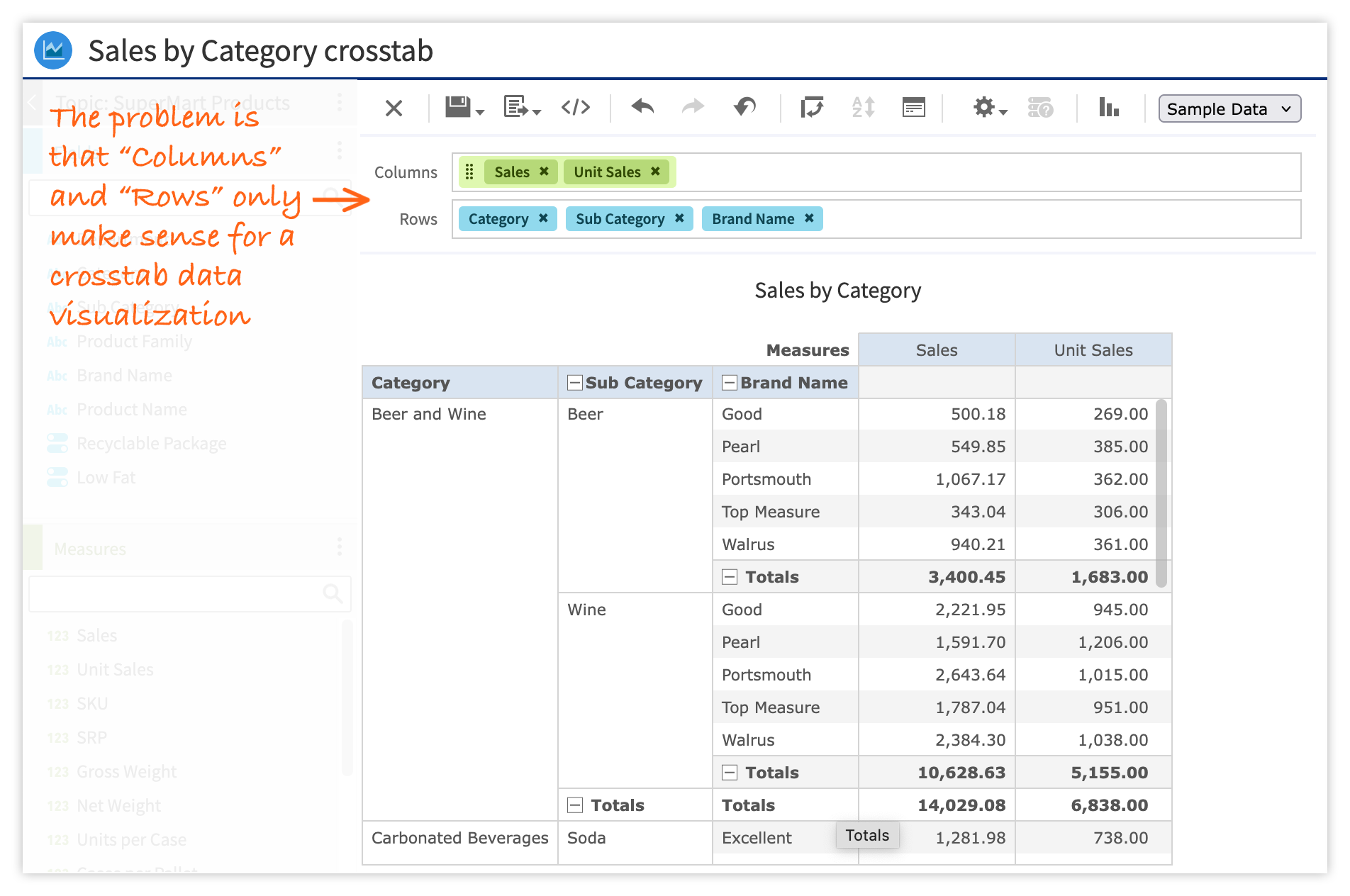
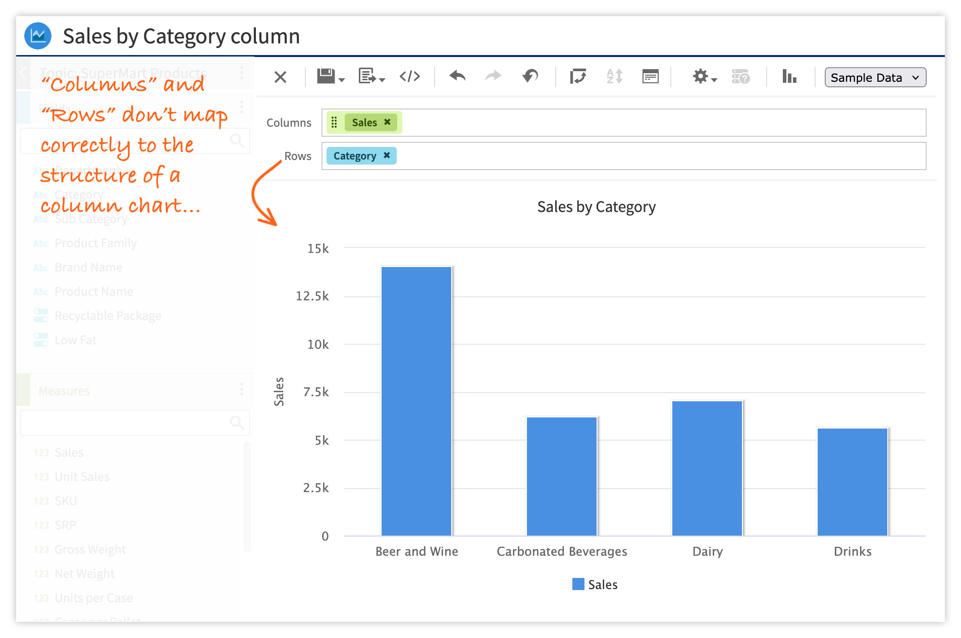
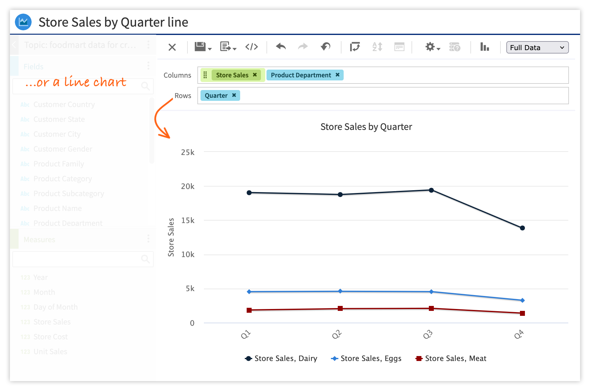
JasperReports Server (JRS) is an enterprise BI application that enables users to create and share data visualizations, reports, and dashboards. The environment for creating data visualizations (Ad Hoc Designer) was problematic because it wasn't up to industry standards and it failed to meet user expectations. A common complaint from users was that it was unclear how to build the expected visualization—they just relied on trial and error.
Redesign the data visualization creation UI using our new modern component library
Our data visualization creation experience needed to be in line with industry standards and users’ expectations. Specifically, we had to make the building blocks clear and eliminate guesswork. We would replace “Columns” and “Rows” with building block drop areas that made sense. This would require a redesign of the visualization creation UI.
We were building a design system that included customized Material UI components. The rollout plan was to build any new features using these new components. The new visualization creation UI would be built from these new components. If the redesign required a component that wasn't already in the new library, we'd build it and add it to the library.
First, some research
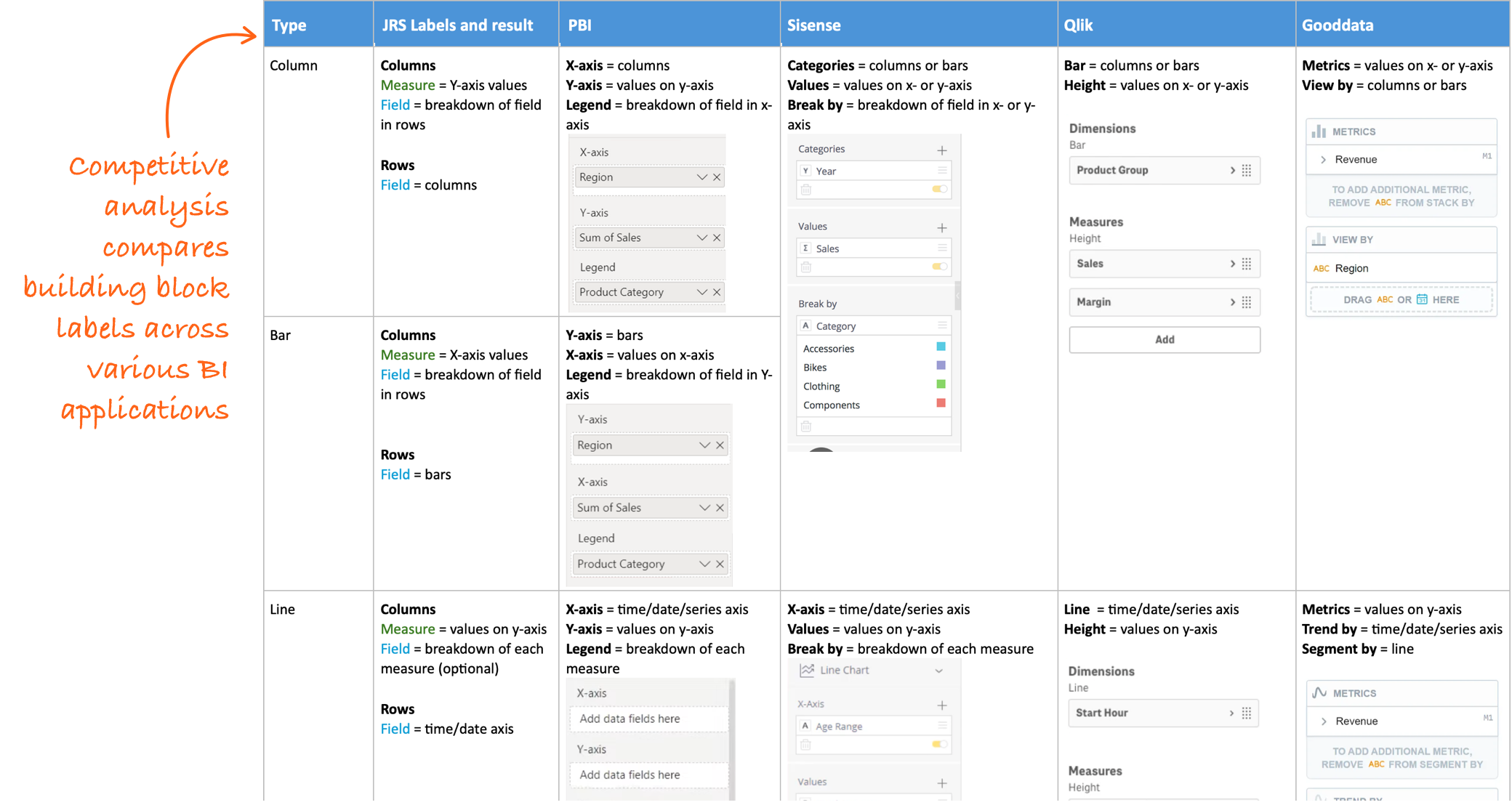
Competitive analysis
I started by evaluating other popular BI applications such as Power BI, Sisense, Qlik Sense, and GoodData. The goal was to see how other applications label the building blocks of their data visualizations compared to our “Columns” and “Rows”.
Workflow audit
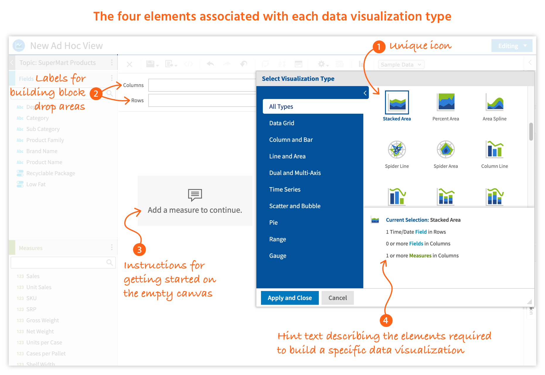
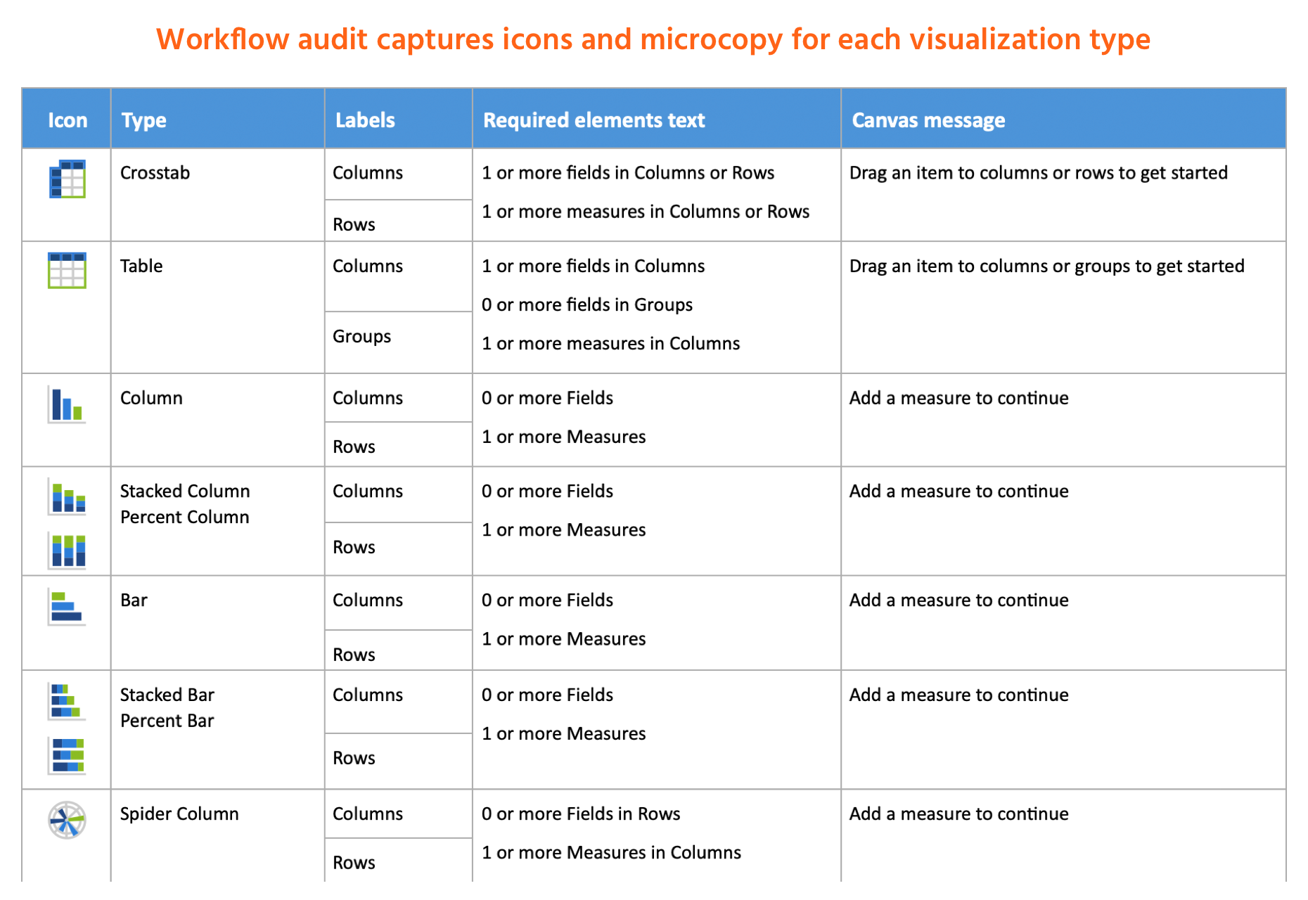
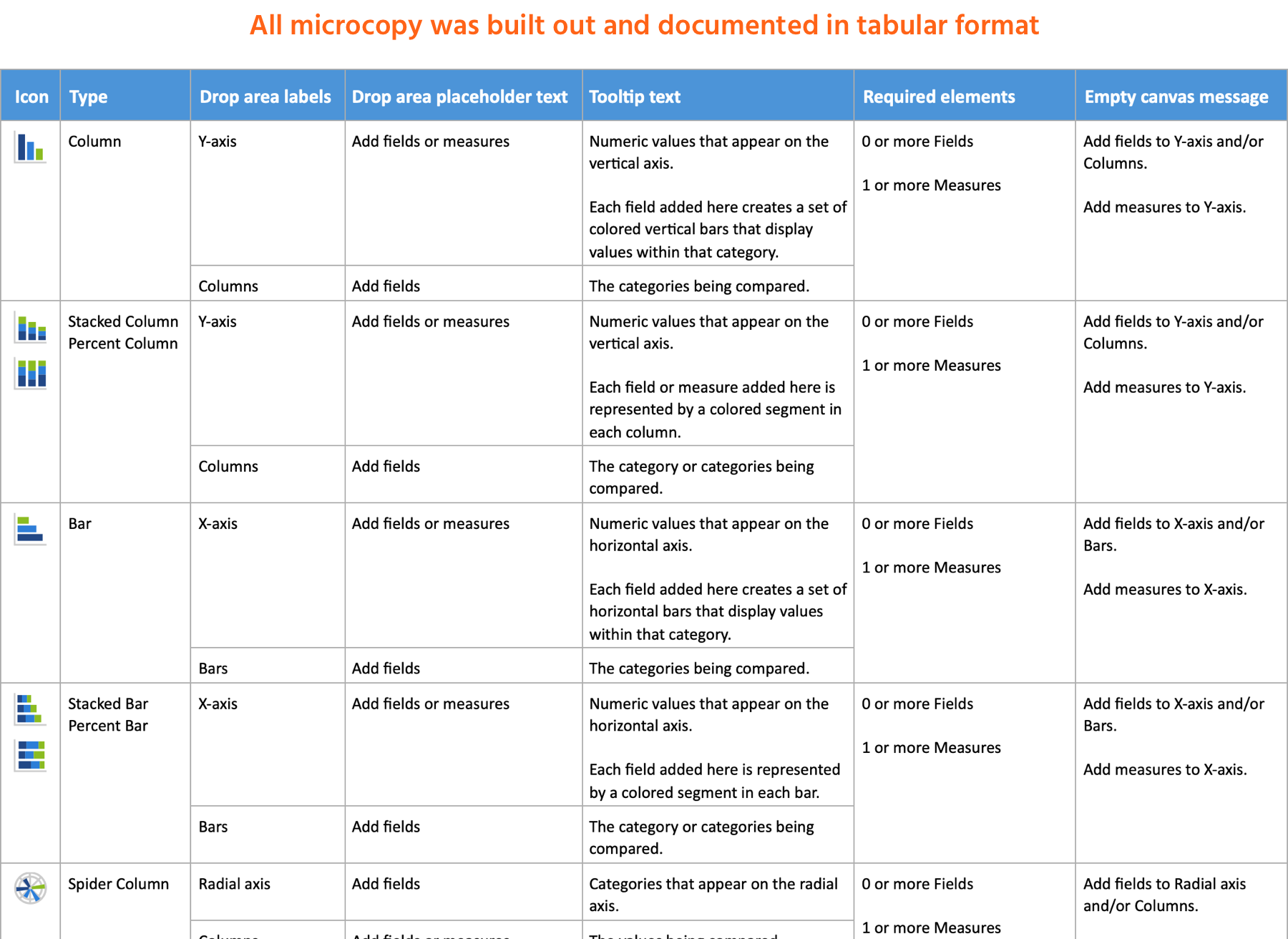
Each visualization type had four associated UI elements: a unique icon and three areas of microcopy.
I did a comprehensive review of the workflow for creating each visualization type, documenting the specific UI elements for each.
Research results
The competitive analysis gave us insight into industry-standard labeling. Our intention was not to replicate labels from a single product, but to establish a reference for creating our own naming conventions. Although some labels did map over directly, we would write the majority of our own.
The workflow analysis helped us assess the existing UI elements and microcopy. We concluded that the unique icons would remain unchanged, but improvements were needed for all existing microcopy. Additionally, the building block drop areas would contain placeholder text and their labels would display a tooltip on hover.
The three-step design phase generated and unified content with visual design
Step 1: Content design
The content design plan was to create four categories of microcopy:
- Labels for building block drop areas
- Placeholder text for building block drop areas
- Tooltips for building block drop areas
- Required elements text for empty canvas message
Tooltips and placeholder text needed to be written from scratch while the drop area labels and required elements text would be improvements on the original microcopy.
I returned to the workflow audit documentation to build out the content. Using the same format, I collaborated with the product manager to write all microcopy.
Step 2: Visual design
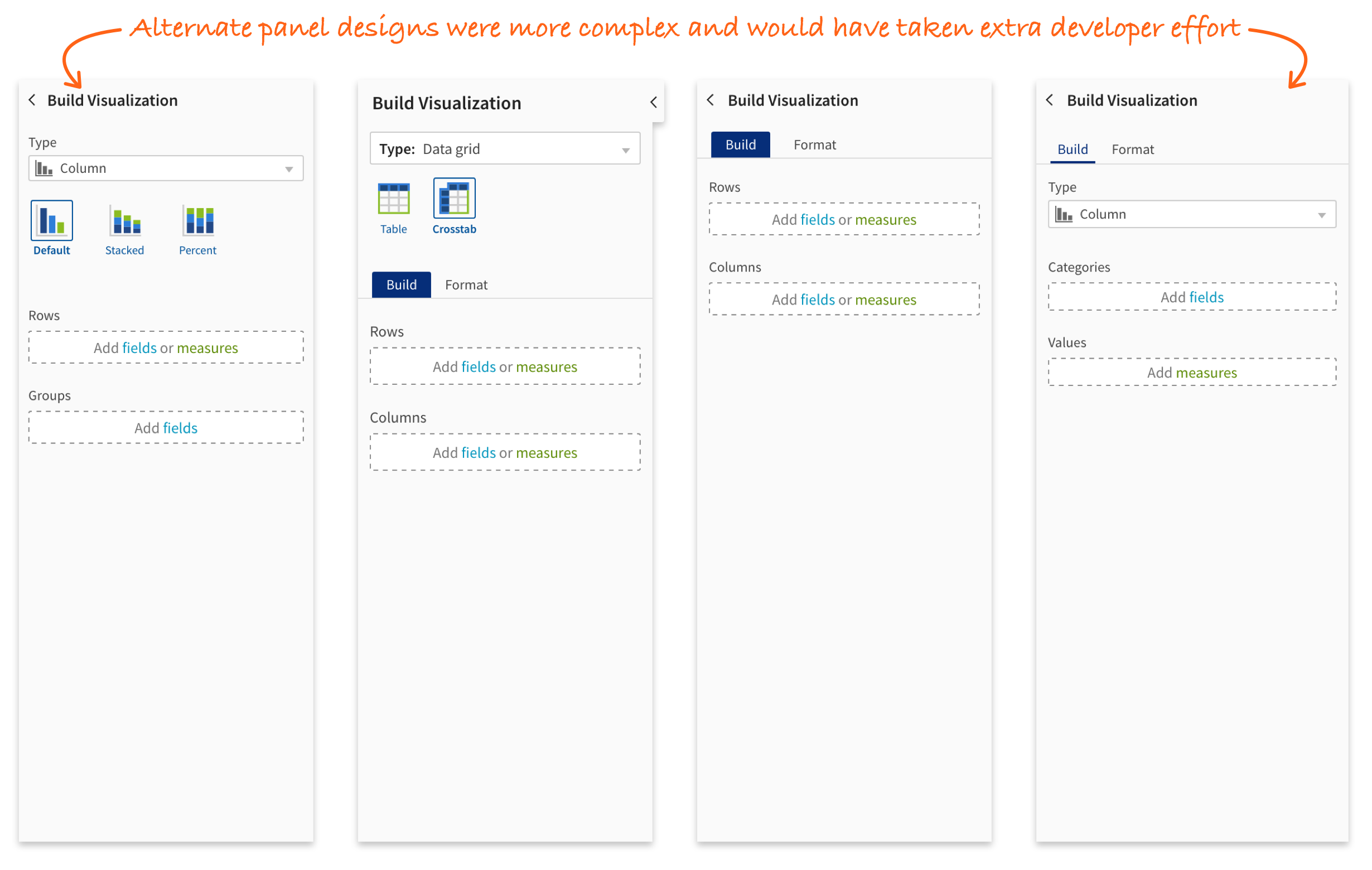
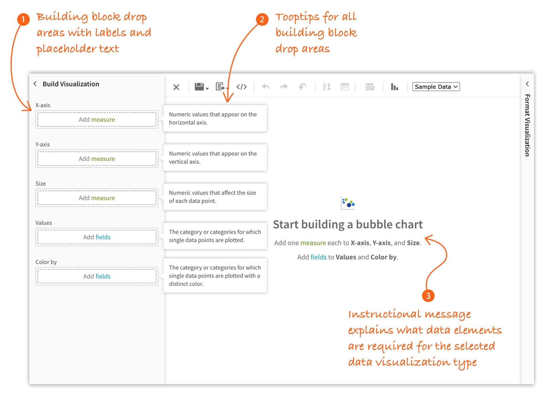
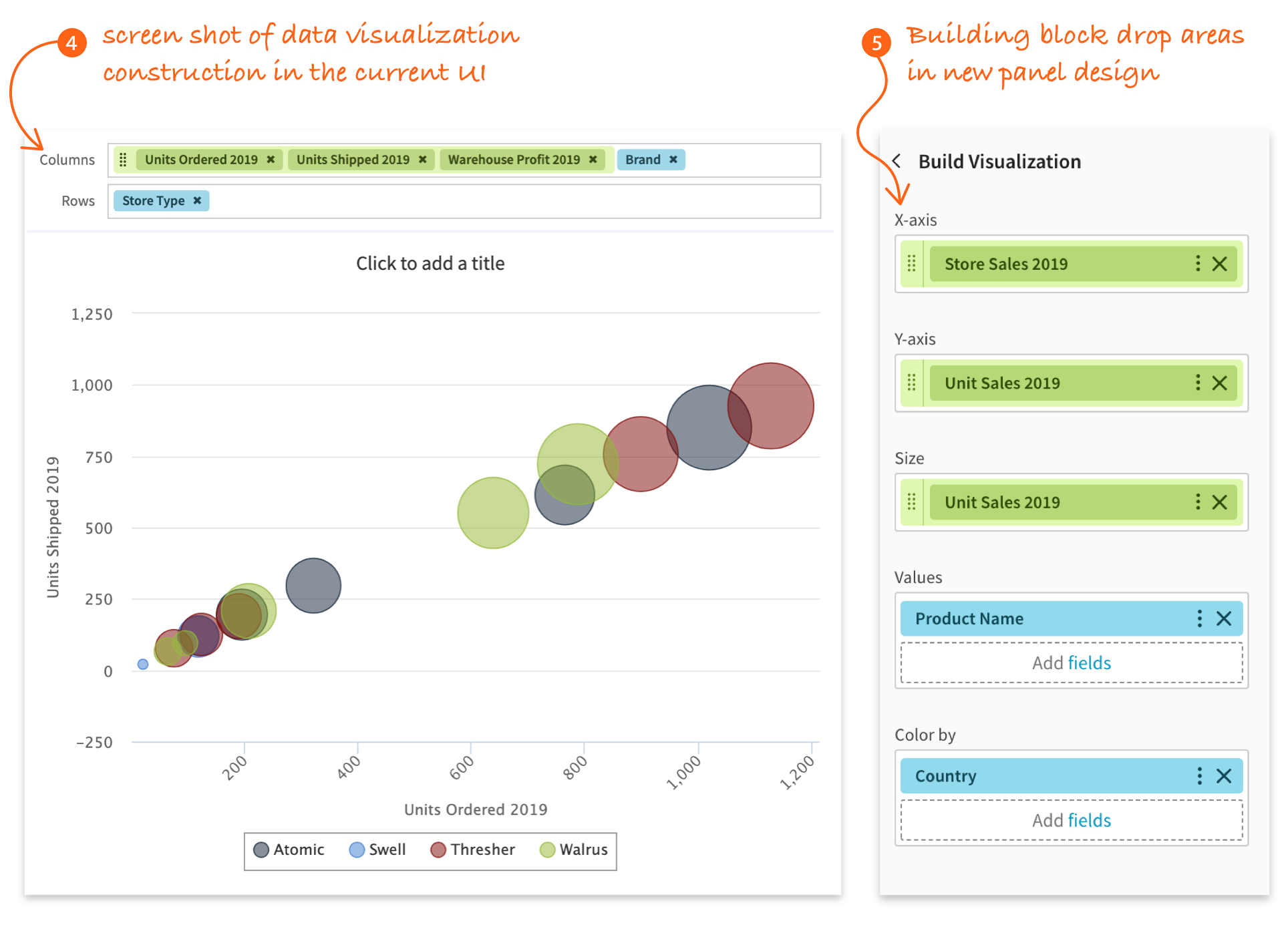
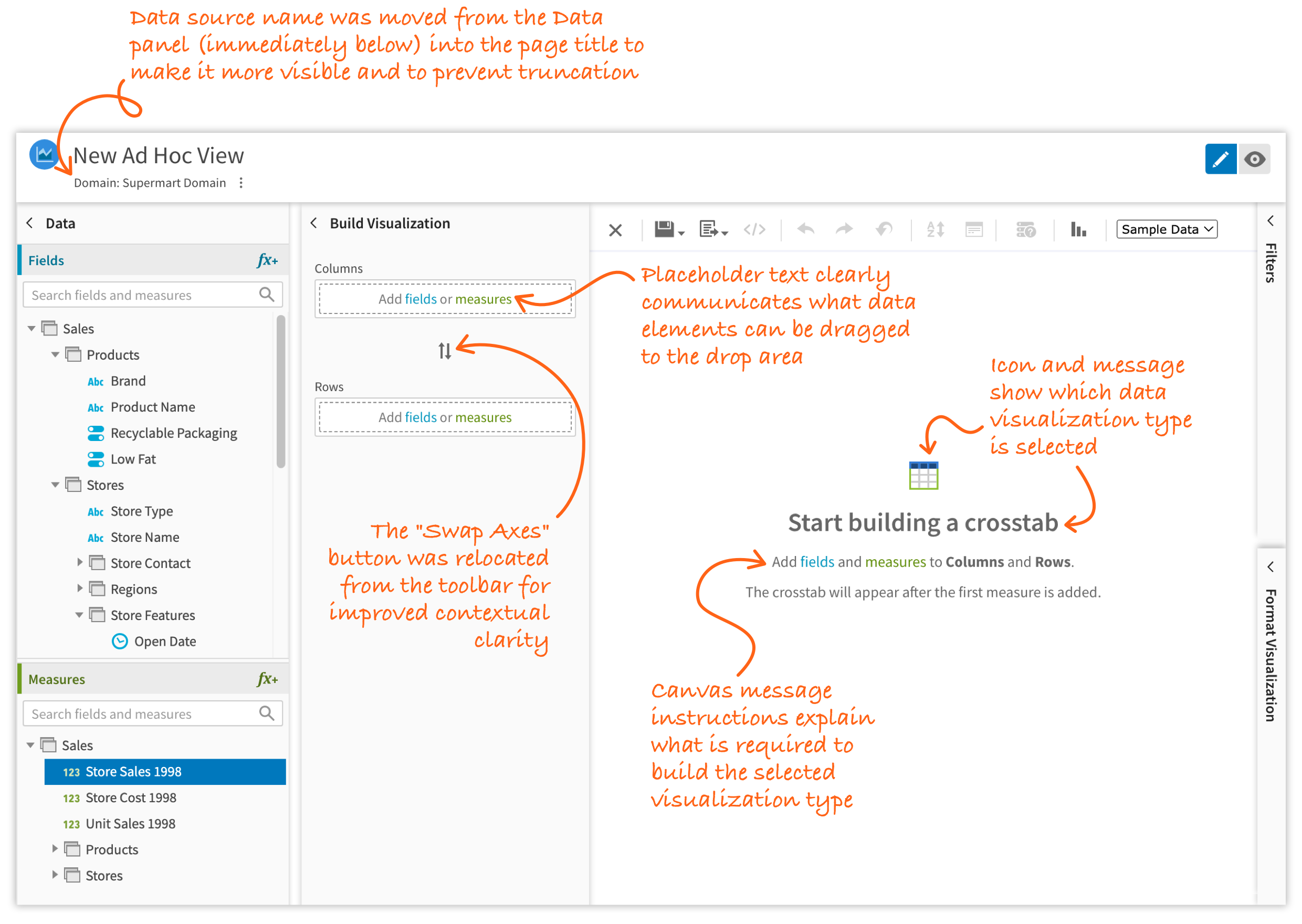
It was clear that keeping the building block drop areas above the canvas was impractical. The UI needed to display up to five drop areas without compromising the vertical space needed for the data visualization. Any more than two would increase their container’s height and crowd out the data visualization. To accommodate the additional drop areas, we decided to add a side panel strictly for these elements.
I created prototypes of various panel designs in AdobeXD. The product team and I then evaluated each one, selecting the most feasible design based on usability, complexity, and effort.
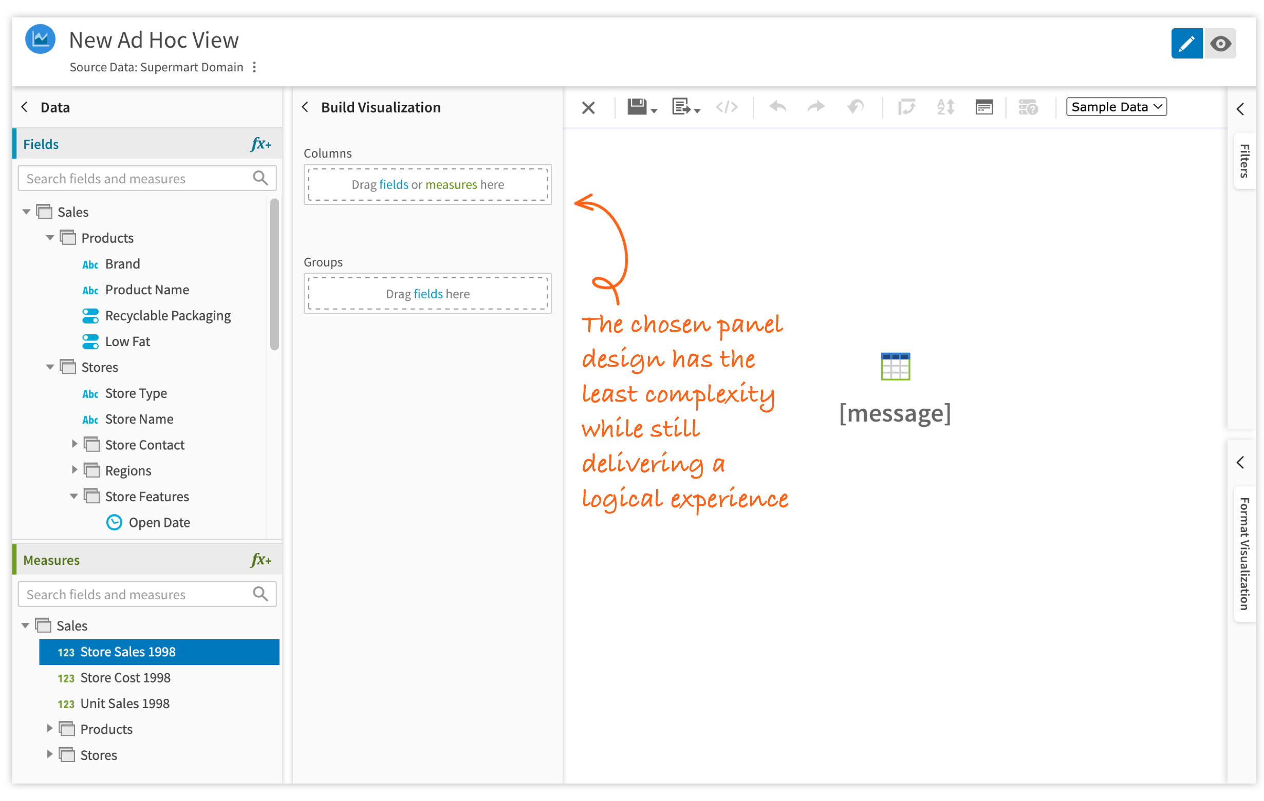
Step 3: Integrating content into the design
For every data visualization type, I created a prototype in AdobeXD that contained:
- Building block drop areas as they appear before a visualization is created
- Tooltips that appear when building block label is hovered
- Instructional message on the canvas before a visualization is created
- Screen shot of the data visualization in the current UI
- Building block drop areas as they should appear after the visualization is created
Collaborating with engineering and QA
Building components and screens
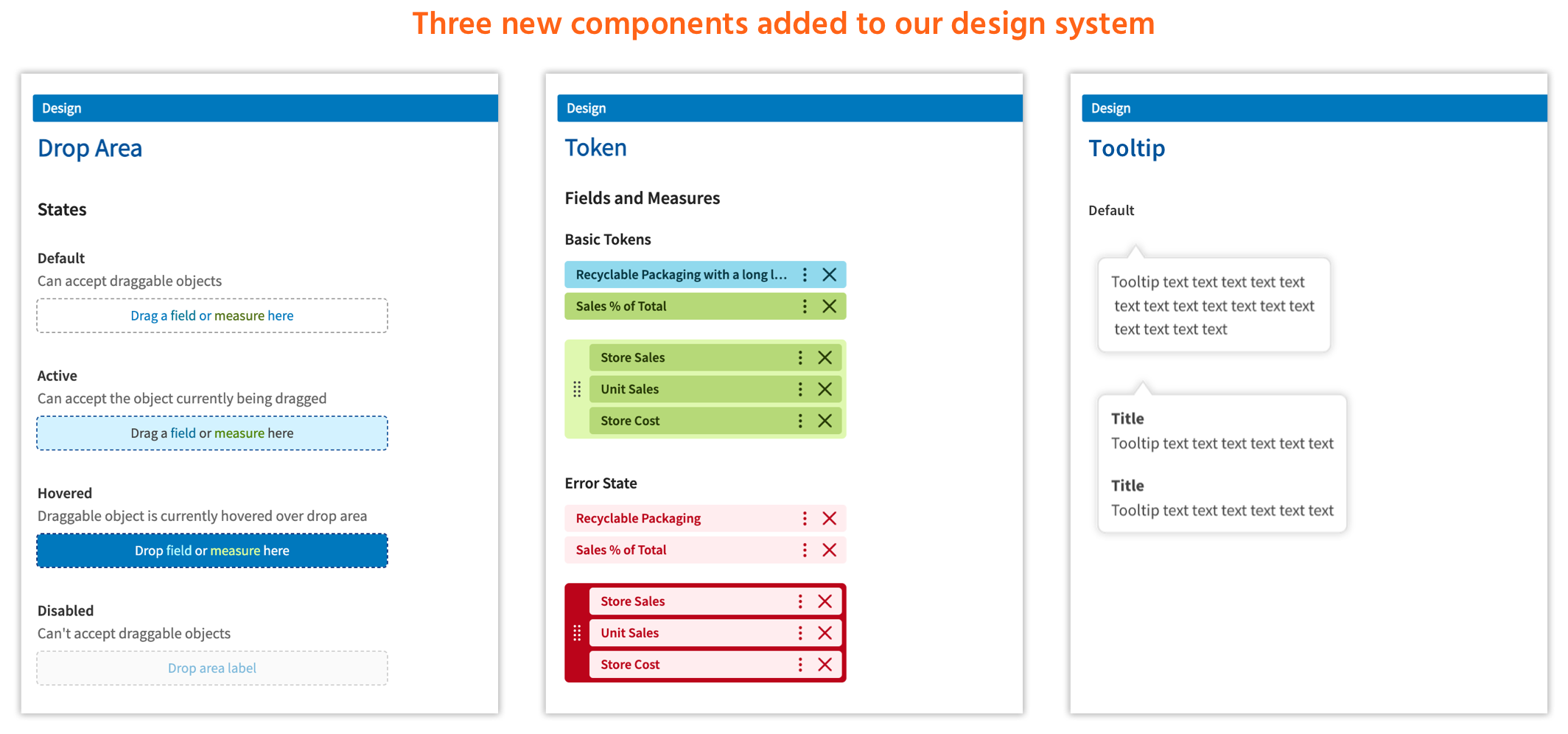
We were already in the process of building a design system that included customized Material UI components. Many components had already been created and implemented in JRS. Any new components we might need would be created on an as-needed basis. This project would require the addition of three new components.
The process we followed for building new components was developers would add out-of-the-box MUI components to Storybook. I would add custom CSS classnames, if needed, and write the supporting CSS. Once this was finished, developers would build out the reusable component.
Developers had a great deal of work to do on the underlying logic. To help relieve their workload, I created draft versions of the screens using only HTML and CSS to serve as a reference for the code structure. This was so they could easily build the screens using the production-ready components.
Testing and bug fixing
Once we entered the testing phase, I supported QA and engineering:
- Communicated with QA when I found a bug
- Confirmed with QA if particular issues were bugs or intended behavior
- Triaged, troubleshot, and ressigned UI bugs
- Fixed any UI bugs within my technical expertise
A clear UI eliminates unexpected results
The redesigned Ad Hoc Designer visualization building UI was recently released in JasperReports Server 9.1 (December 2025).
Other Team Members
- 1 Project Owner
- 4 Developers
- 1 QA Engineer
My Contributions
- Conducted competitive analysis
- Created high-fidelity prototypes
- Created UI specifications
- Wrote HTML and CSS
- Wrote and edited microcopy
- Fixed UI bugs